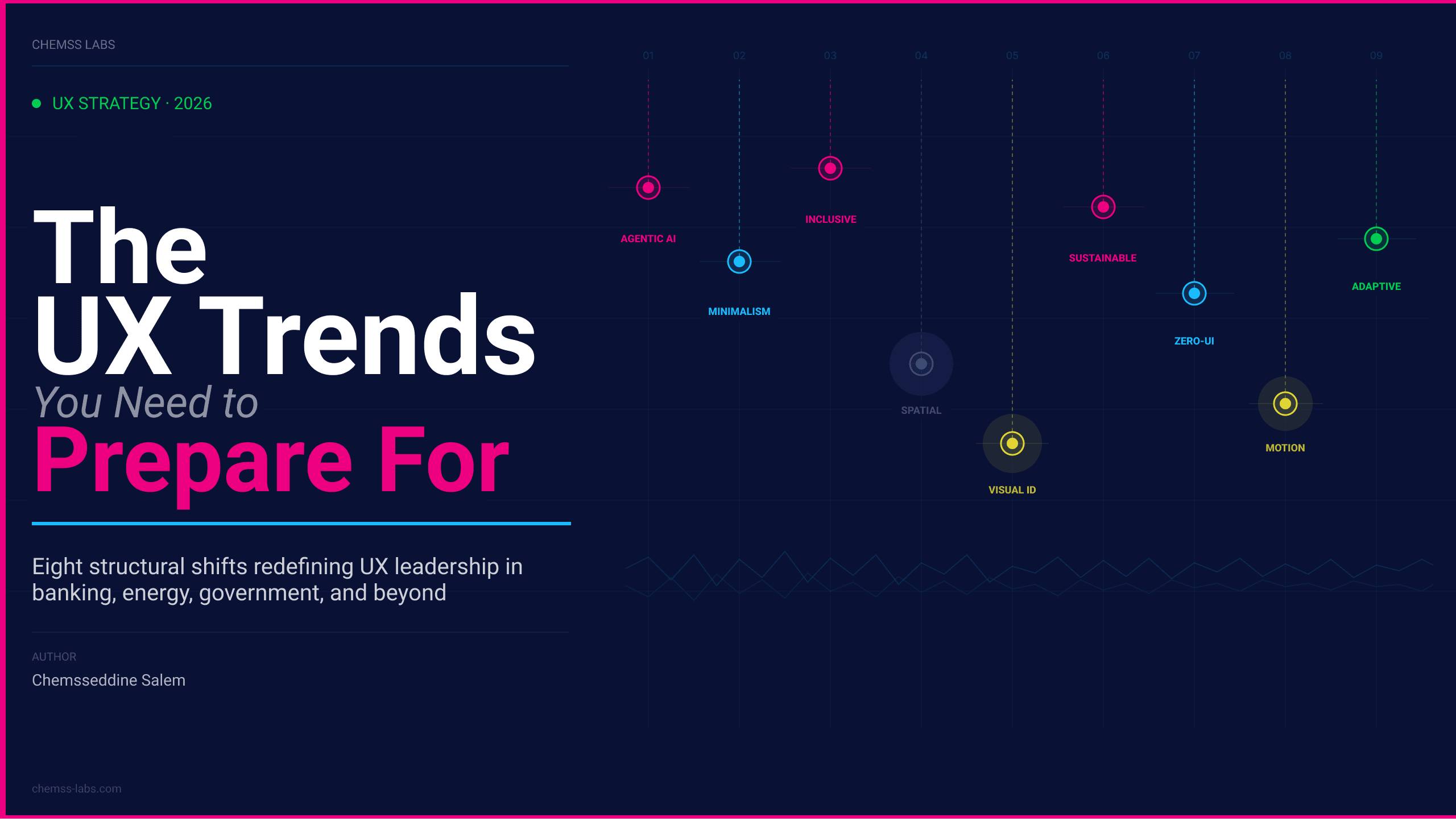
The Cultural Impact on Design Psychology
Design doesn’t live in a vacuum; it lives in people’s heads and those heads are shaped by culture.

Chemss Salem

Design does not operate in a vacuum. It operates inside heads shaped by decades of cultural conditioning and those heads determine whether your interface feels immediately legible or quietly wrong. Culture is not a layer to apply after the product is designed. It is the context that determines what the product means.
This matters more than most design teams acknowledge. The standard response to internationalisation is translation and localisation swap the text, flip the layout for RTL scripts, adjust the date format, done. That approach treats culture as a formatting problem. The evidence from practice in banking, healthcare, energy, and government systems tells a different story: the same interface architecture that earns trust in Sweden can read as evasive in Japan, the same error message that feels helpful in Germany can feel blunt to the point of hostility in Thailand, and the same scarcity signal that drives conversion in the United States can actively reduce it in Switzerland.
Culture shapes how users perceive risk, read visual hierarchy, decide whom to trust, resolve ambiguity, and judge whether a system is on their side. These are not edge cases in UX psychology they are its operating conditions. And in regulated industries, where the cost of a trust failure is measured in abandonment, complaint escalation, and regulatory exposure, getting them wrong is not a localisation oversight. It is a product failure.
1. The Cultural Dimensions That Matter for UX
Six foundational dimensions, developed through decades of cross-cultural research by Hofstede, Hall, and others, provide a structured vocabulary for anticipating how users in different societies interpret and interact with interfaces. These are not stereotypes they are hypotheses, calibrated by behaviour data and user research, that tell you where to look for design divergence.
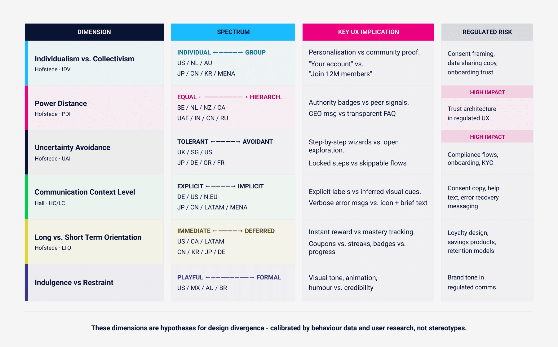
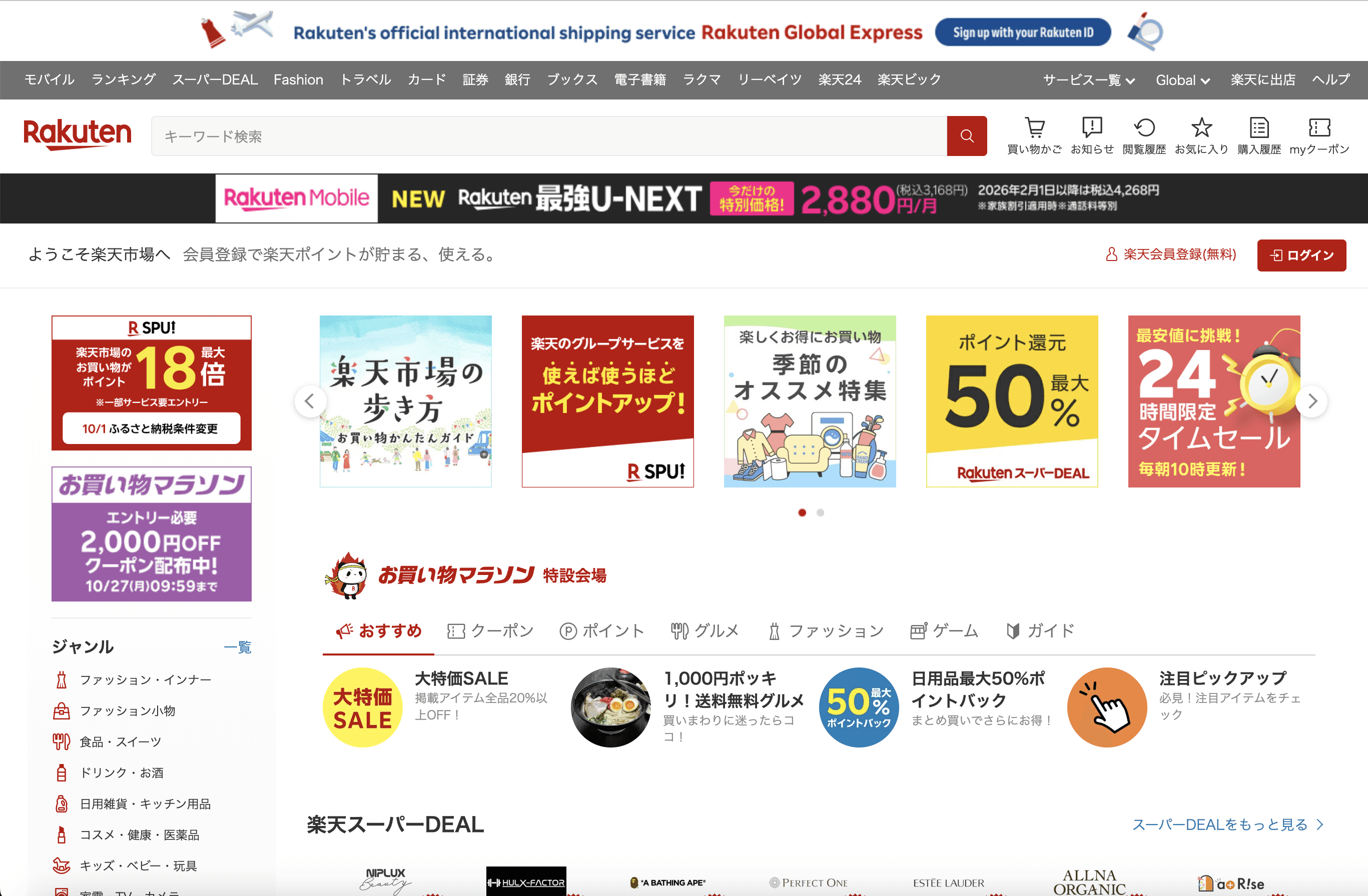
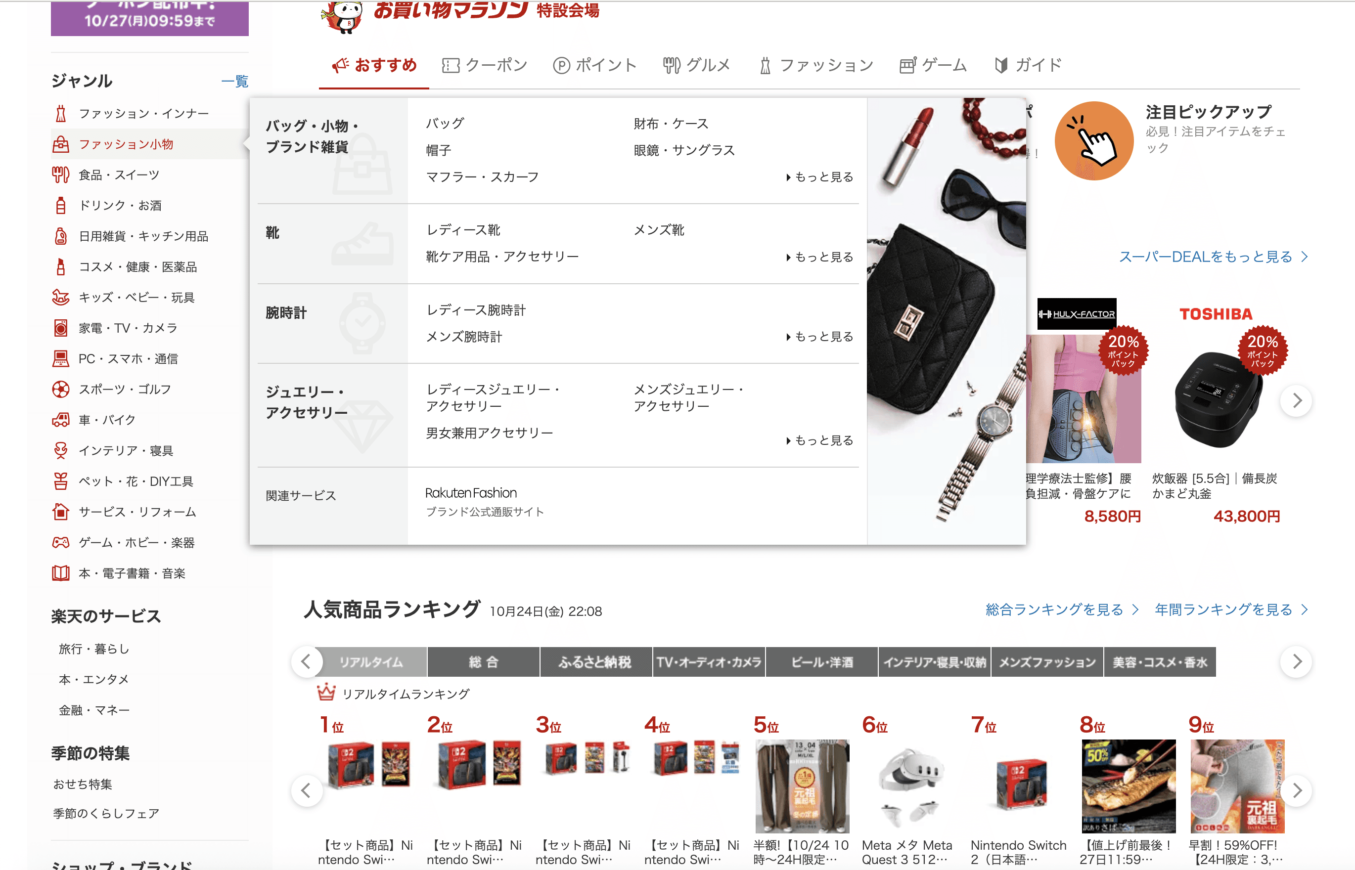
Individualism versus collectivism determines whether users experience an interface as a personal tool or a communal one. Individualistic contexts produce users who expect personalisation, autonomous exploration, and “your account” framing. Collectivist contexts produce users who respond to community proof, shared outcomes, and “join millions” framing. Amazon’s US homepage and Rakuten Japan demonstrate this structurally: one optimises for personal discovery, the other for participation in a loyalty ecosystem.
Amazon US homepage personalized “Your account,” “Inspired by your browsing” (individual autonomy).

Rakuten Japan homepage community rewards, group points.
Power distance governs how users read authority signals. In high power-distance contexts UAE, India, parts of East Asia institutional credentials, CEO endorsements, and certification badges are primary trust signals. In low power-distance contexts Scandinavia, the Netherlands, New Zealand those same signals can register as authoritarian. A digital banking sign-up page in the UAE that led with Central Bank approval badges and a CEO message increased conversion; the equivalent page in Sweden increased it by removing the CEO message and replacing it with a transparent FAQ.
UAE banking app - signup screen with CEO endorsement and certification badges.

Swedish equivalent - with transparent FAQ replacing CEO message.
Uncertainty avoidance determines tolerance for ambiguity and novelty. High uncertainty-avoidance users in Germany or Japan require step-by-step progress indicators, prescriptive error recovery, and confirmation at every stage. Low uncertainty-avoidance users in the UK or Singapore experience the same structure as unnecessary friction. A European investment app that implemented a five-step progress bar with constant state reassurance saw completion rise 18%; the same product’s US version condensed onboarding to two screens with a skip option.
High-context versus low-context communication Edward Hall’s distinction determines how much information users expect the interface to carry explicitly versus implicitly. German and North American users need field labels spelled out, error messages precise, and instructions self-contained. East Asian and Latin American users can infer from visual context, and verbose instructions can feel redundant or condescending. The same privacy consent dialog tested better as a detailed bullet-point disclosure in the Netherlands and as a concise summary with a link to detail in South Korea.
Long-term versus short-term orientation determines what motivates sustained engagement. Long-term oriented users in South Korea, Japan, and Germany respond to mastery tracking, progress depth, and compound benefit framing. Short-term oriented users in North America and much of Latin America respond to immediate rewards, instant certificates, and visible wins. A fitness app in South Korea that emphasised streaks and consistency badges retained users 20% better; in the US, immediate milestone discounts outperformed streaks.
Samsung Health (Korea) focusing on streaks & progress tracking.
Fitbit (US) focusing on instant milestone rewards.
Indulgence versus restraint determines the appropriate register for visual tone. Indulgent contexts United States, Brazil, Australia tolerate and reward playfulness, vibrant colour, and casual copy. Restrained contexts Russia, South Korea, parts of Central Europe read the same signals as unprofessional. A confetti animation after a budget goal was celebrated in Australia and rejected as frivolous in South Korea; replacing it with a completion banner raised satisfaction scores.
2. Visual Language Is Not Universal
The assumption that clean, minimal design is culturally neutral is one of the most expensive mistakes in international product development. Visual language colour, iconography, layout density, motion tempo carries culture-specific meaning, and those meanings diverge in ways that directly affect trust, comprehension, and conversion.
Colour semantics are the most frequently cited example and still the most frequently ignored in practice. Red carries urgency and warning associations in North American and European contexts. In Chinese culture, it signals celebration and prosperity. A limited-time deal banner using red for urgency in North America may communicate festivity rather than scarcity in parts of Asia which explains the absence of the conversion pressure the designer intended.
Iconography is less discussed but equally consequential. Icons draw on shared cultural knowledge that is not shared across cultures. A thumbs-up confirmation, a mailbox as email metaphor, a piggy bank for savings these carry intuitive meaning in the contexts where they were developed and noise or negative connotation elsewhere. Replacing a thumbs-up confirmation with a neutral checkmark eliminated negative associations in markets where the gesture carries offensive meaning without degrading comprehension in markets where it did not.
Layout density is culturally calibrated. Japanese e-commerce interfaces carry information density that would read as cluttered in a Western design audit but corresponds precisely to local browsing expectations. The same density in a German B2B tool would undermine the clarity signals the audience expects. Neither is objectively wrong. Both are locally correct.
Motion tempo is the subtlest of these signals and the hardest to get right from a distance. A map pin animation that felt appropriately snappy to US users tested as rushed in Western Europe; shortening it by 150ms for the US version and lengthening the ease-out for the European version changed the brand perception without altering functionality.
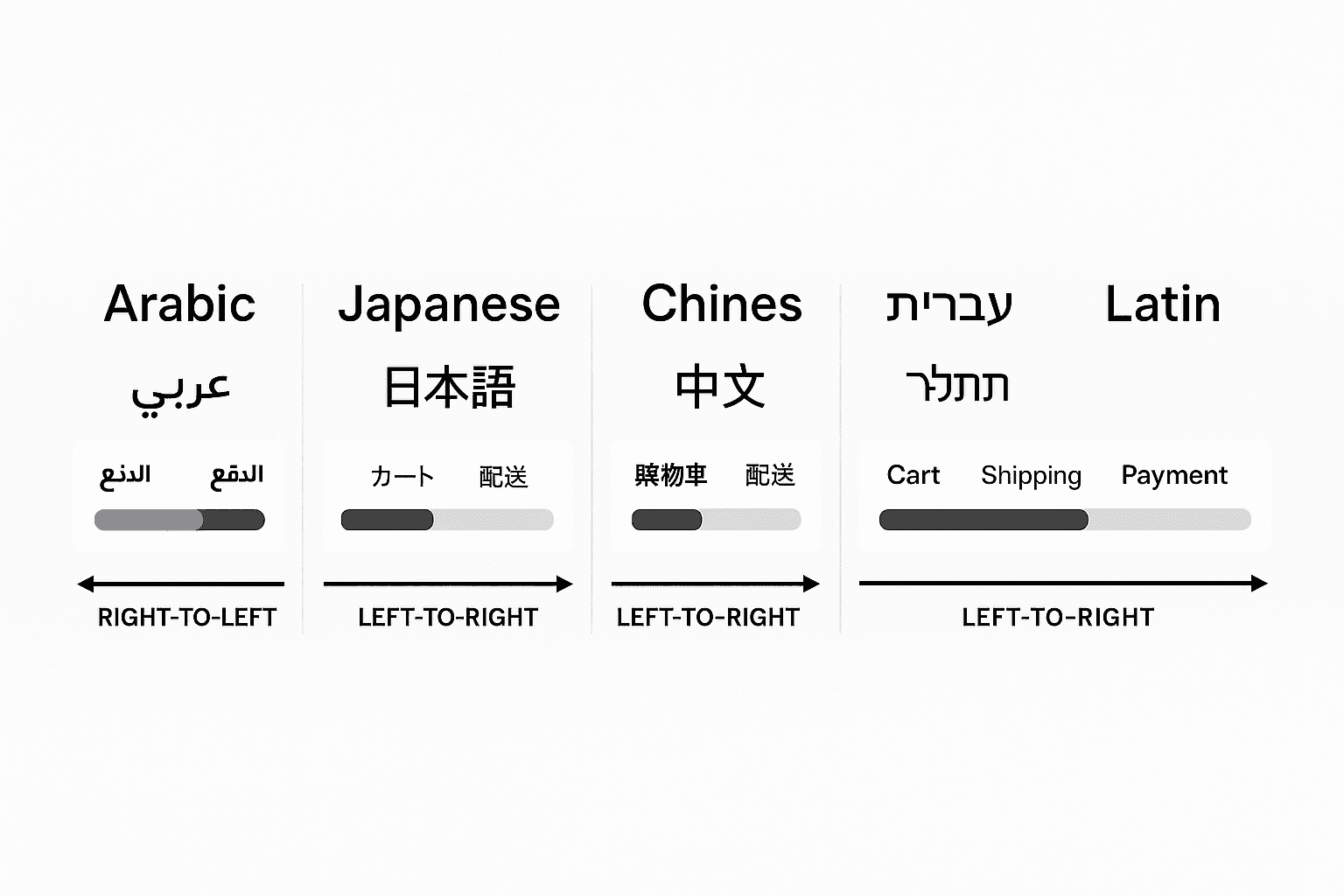
RTL scripts Arabic, Hebrew, Urdu do not merely flip text. The entire spatial logic of the interface inverts: scanning direction, progress bar orientation, icon directionality, carousel navigation. A checkout progress bar that moves rightward signals forward momentum in LTR contexts and backward momentum in RTL. This is not a technical problem with a single technical fix. It requires rethinking how directionality communicates meaning in every interactive element.
Macy's - US e-commerce: Direct “Save 15% this weekend only.”

Japan e-commerce: “Enjoy special savings this weekend” with visual motifs.
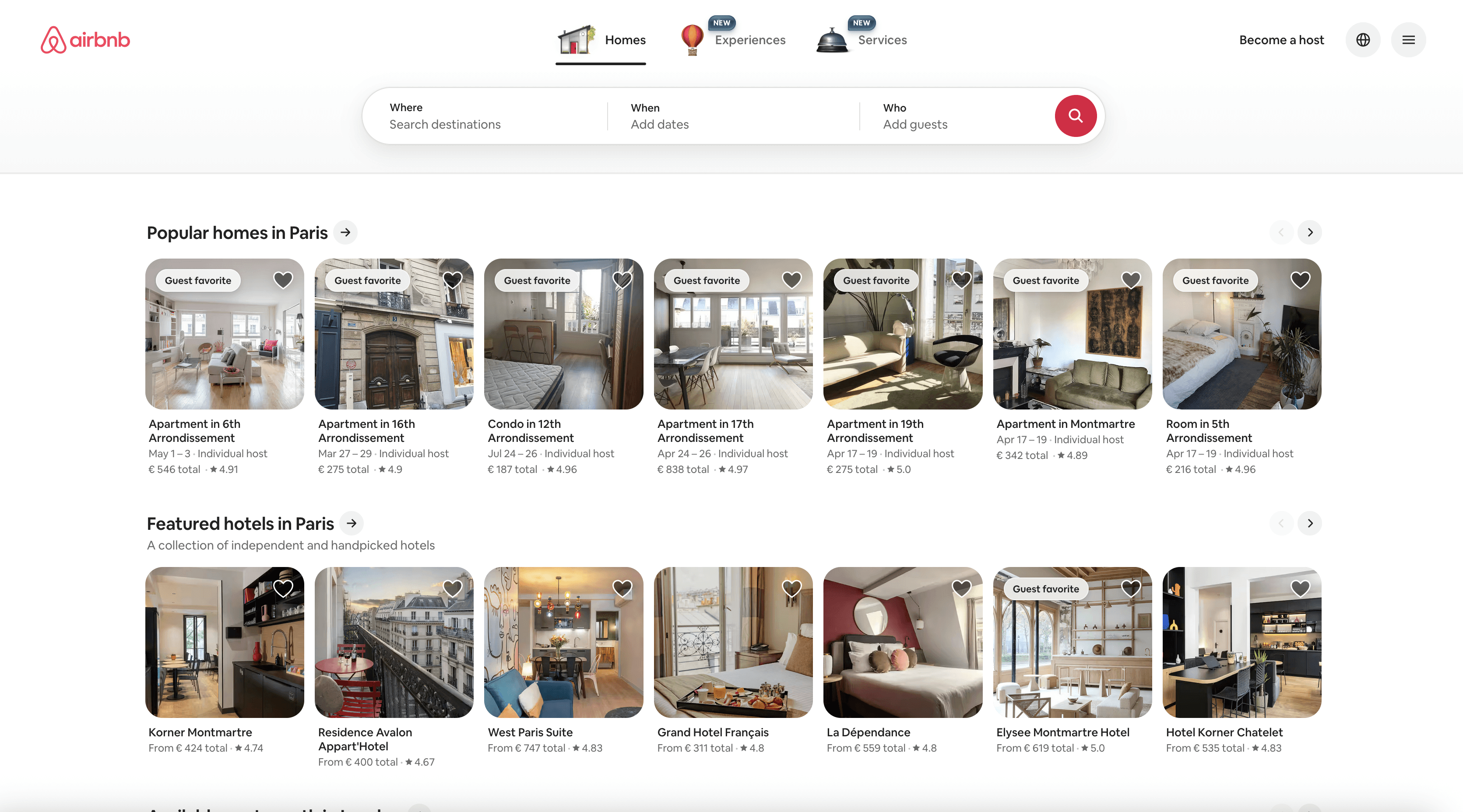
Airbnb US homepage - lifestyle imagery, vibrant palette.
https://www.airbnb.com/
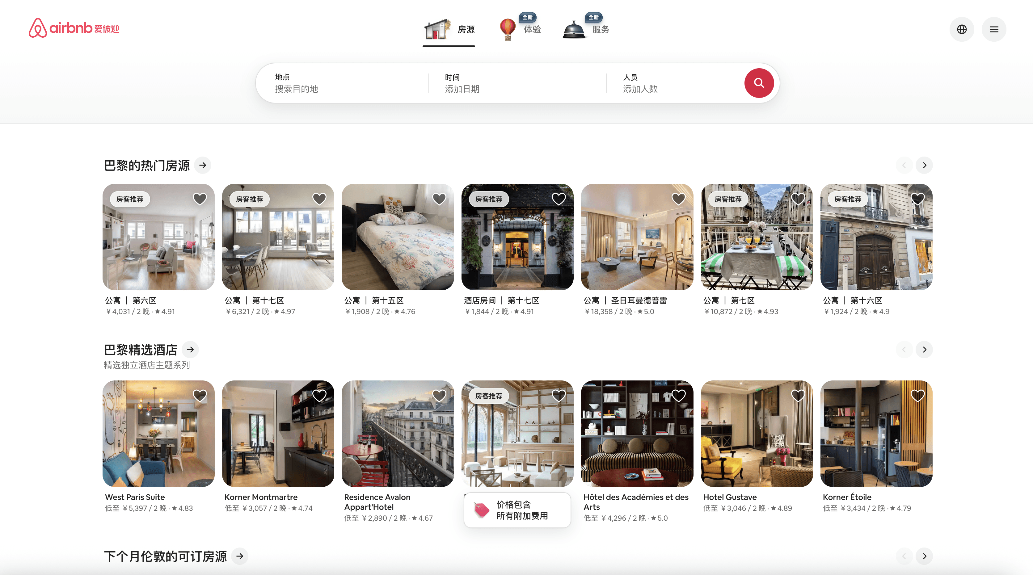
Airbnb China - subdued colors, trust verification cues.
https://www.airbnb.cn/
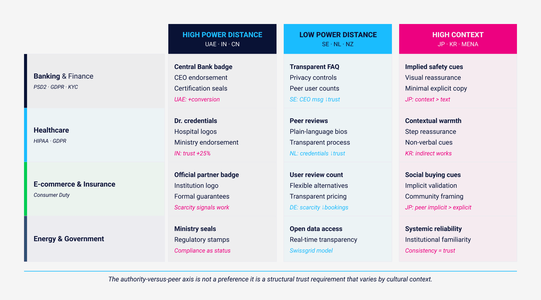
3. Trust Signals Are Culturally Structured
Trust in digital products is not a single variable. It is constructed from multiple signals whose relative weight depends entirely on cultural context and in regulated industries, misreading that hierarchy has direct consequences for compliance, conversion, and retention.
The clearest dimension is the authority-versus-peer axis. In high power-distance contexts, institutional authority ministry badges, hospital credentials, bank licensing marks, professional certifications carries primary trust weight. In low power-distance contexts, the same signals can feel intimidating or irrelevant, and peer signals patient ratings, transparent bios, user review counts carry more weight. A healthcare portal that led with hospital and ministry badges increased trust scores 25% in India; the same layout tested as intimidating in the Netherlands, where users preferred peer reviews and plain-language doctor bios.
Content language is the second major trust variable. A system that speaks in the register of a knowledgeable, calm professional specific without being bureaucratic, direct without being cold builds credibility in most contexts. But what counts as direct varies. Monzo built a UK customer base in part by replacing standard banking error copy with human-scaled explanations: “Looks like there wasn’t enough in your account” instead of “Transaction declined: insufficient funds.” That tone built an NPS above 70. The same copy would require different calibration for German users, who expect precision, and for Thai users, who expect warmth and politeness particles.
Scarcity and urgency signals are where cultural divergence is most commercially consequential. “Only 2 rooms left” is a standard conversion mechanism in US e-commerce. In Germany and Switzerland, A/B tests showed it increasing perceived pushiness to the point of reducing bookings. Replacing it with “Demand is high on these dates here are flexible alternatives” increased both bookings and reduced cart abandonment in those markets.
4. Information Architecture Is Not Culture-Neutral
The structural decisions that feel most technical in UX navigation depth, menu breadth, step sequencing, progressive disclosure are themselves culturally loaded.
Depth versus breadth in navigation reflects different assumptions about how users categorise information. US e-commerce interfaces tend toward flat, search-first navigation with prominent filters that get users to product quickly. Japanese marketplaces tolerate and expect category depth nested hierarchies with dense link clusters because that structure aligns with local browsing habits and signals thoroughness rather than complexity. Neither approach is transferable as-is.
Sequenced versus parallel flows map onto uncertainty avoidance. A mortgage pre-approval journey can present as a locked wizard with explicit steps in Germany users trust the structure, progress bar reassures, nothing is left ambiguous. The same journey can offer skippable sections and playful calculators up front in Australia or the US users prefer to explore, form expectations on their own terms, and encounter less friction. Forcing a German wizard on an Australian user reads as slow; forcing Australian parallel exploration on a German user reads as incomplete.
Progressive disclosure operates differently across context levels. In low-context markets, every accordion that hides information risks being read as the product concealing something. In high-context markets, showing everything up front reads as noise. A privacy consent dialog that spelled out data uses in explicit bullets improved trust in the Netherlands; a concise summary with an expandable detail link tested better in South Korea.
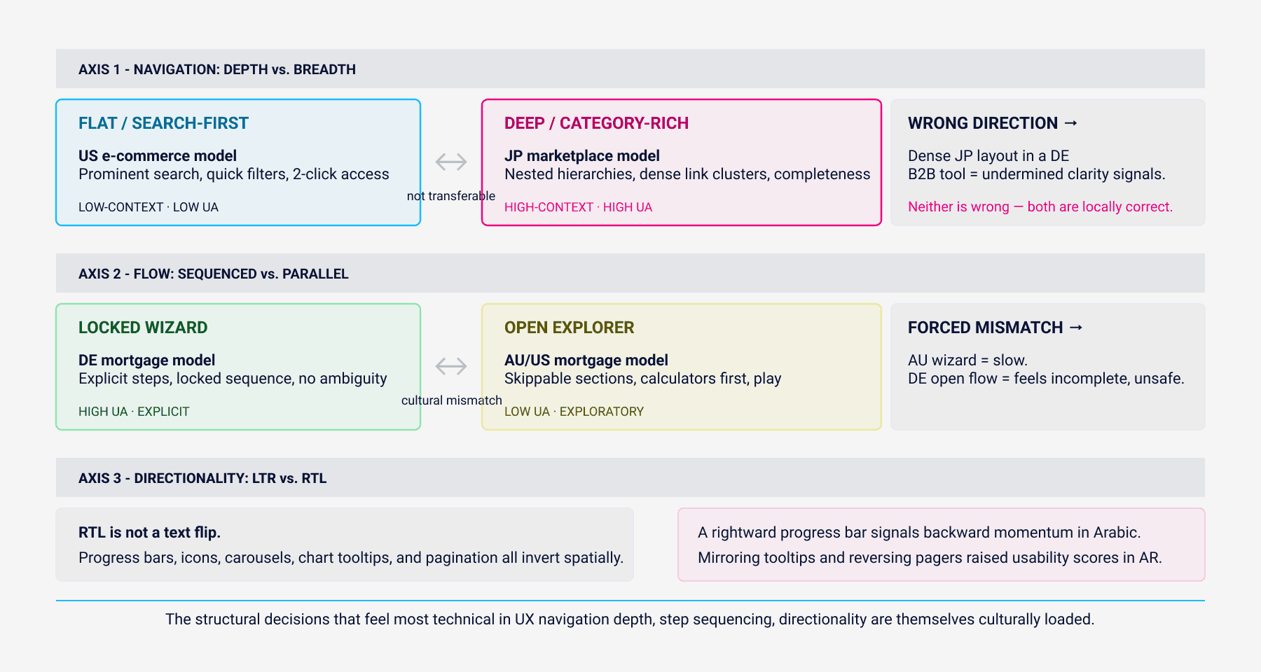
US e-commerce
US e-commerce: A broad mega-menu with prominent search and quick filters.

Japanese marketplaces
Japanese marketplaces: Category depth with nested lists and dense link clusters works because it aligns with local browsing habits.
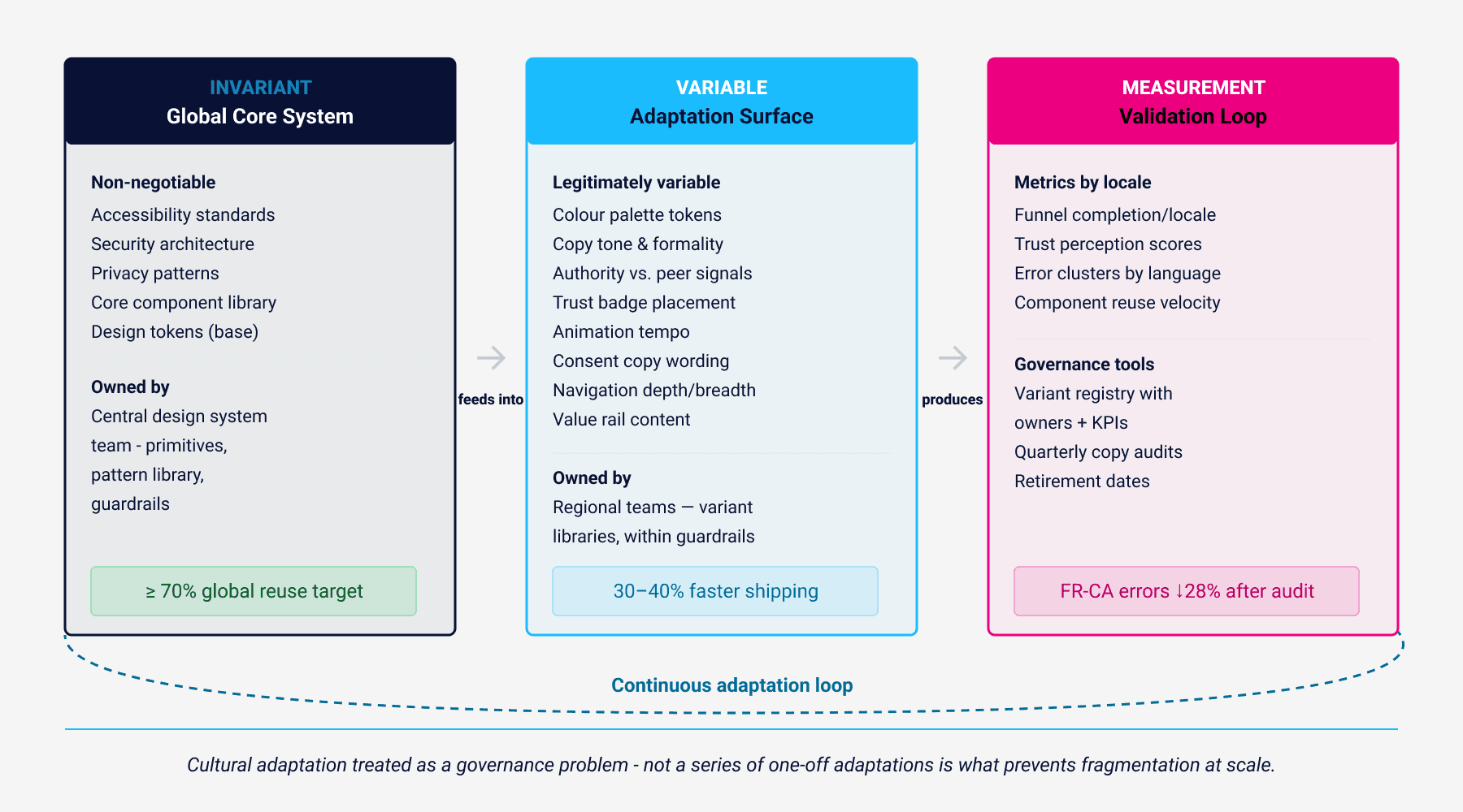
5. Cultural Adaptation Requires a Governance Model, Not a Checklist
The failure mode in cultural design is not ignorance most teams are aware that culture matters. The failure mode is treating it as a series of one-off adaptations: a translated banner here, a flipped layout there, an adjusted colour token for a seasonal campaign. This approach produces fragmentation without coherence and accumulates technical debt at the rate at which markets are entered.
The alternative is treating cultural adaptation as a governance problem. A global design system needs to distinguish between what is invariant across all markets accessibility standards, security patterns, privacy architecture, core interaction models and what is legitimately variable: colour palettes, copy tone, authority-versus-peer signal weighting, trust badge placement, animation tempo. The invariant layer is the core system. The variable layer is the adaptation surface, and it needs to be as carefully governed as the core.
Federated ownership is the structural model that works. A central team curates the design system primitives tokens, component architecture, pattern library and sets the non-negotiable guardrails. Regional teams own variant libraries and adaptation decisions, operating within those guardrails. A marketplace running this model maintained a stable “Core Search Card” structure across all markets while allowing a variable “value rail” coupons in Brazil, eco-score in Germany, seller badges in Japan managed regionally. The result was 30–40% faster shipping velocity for regional teams while keeping global component reuse above 70%.
The measurement discipline matters as much as the structural model. Cultural design decisions without measurement loops become assumptions that age badly as markets evolve. Funnel metrics by locale, trust perception scores, error clusters by language region, and component reuse velocity are the instruments. A tax application that spotted address-line errors spiking only in French Canada found the cause in a field hint that used English formatting examples only; updating it reduced errors 28%.
6. Researching Across Cultures Without Importing Bias
The most common failure in cross-cultural UX research is not a methodological one it is a recruitment and moderation one. Remote research sessions moderated in English, with participants recruited through global panel providers, systematically underrepresent the cultural variation being studied. Participants are more candid and more behaviourally accurate with moderators who share their language and cultural norms. Teams that switched to local moderators for concept tests in India reported twice as many actionable insights versus remote English-only sessions.
Method triangulation is essential because any single research method carries its own cultural bias. Survey instruments built in Western academic traditions embed assumptions about directness and self-report accuracy that do not hold universally. Usability labs embed assumptions about artificial task performance. Diary studies and contextual inquiry surface norms that neither lab nor survey reaches a mobility app that used ride-along ethnography discovered that social norms around sitting in the front seat with a driver shaped UI expectations around driver communication in ways no survey would have surfaced.
The other reliable failure mode is treating national culture as the unit of analysis. National averages obscure subcultures, urban-rural gaps, and generational differences that are often larger than the international variation being studied. Youth-focused flows in Spain performed more like US cohorts than older domestic segments in A/B tests.
Think of cultural design as a continuous loop: learn → adapt → measure → standardize → repeat. Build a system that lets you respect local expectations without sacrificing global coherence. Do that, and your UX will stop feeling like a translation and start feeling like it was made for people because it was.
About the Author
Chemsseddine SALEM is a Lead UX Designer and Researcher specialising in Enterprise SaaS, UX Governance, Finance, and Energy sectors. He is the founder of Chemss Labs and works with organisations navigating large-scale digital transformation in regulated environments.
About


Featured Posts